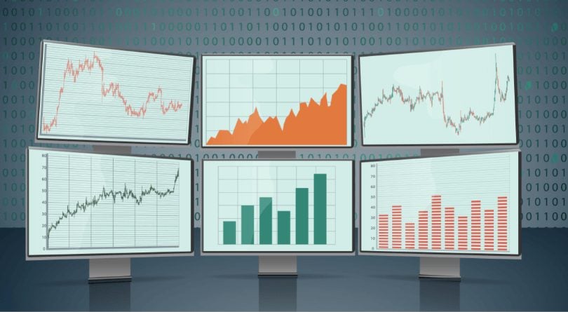
Advanced live charts for forex trading are free and easy-to-use at ForexGDP. These real-time charting packages let you apply technical analysis to hundreds of FX pairs. The charts update live and default to candlestick charts to help you trade foreign exchange. Your forex broker may have charts that don’t update as quickly or have advanced features like at ForexGDP where charts provide short-term or long-term opportunities for technical analysis. Use the live trading charts along with news and education to trading on currencies like the Euro, Pound Sterling, Yen and US dollar.
One of the required disciplines of technical analysis is Charting. Market Charts are the visual representation of price action showing for the assets.
Charts are really required for any technical trader’s using any kind of technical strategies to predict the price movement.
1. How to Use Trading Charts for Effective Analysis
Our Trading Charts provide a complete picture of Live Currency, Stocks, Commodities, Shares, CFDs price movements with successful technical analysis tools.
Identify chart patterns, trends, Candlestick patterns and respond to price action more effectively by typing in your favourite asset and applying moving averages, RSI, Bollinger Bands and other technical forex indicators to enhance your trading.
For more technical analysis and how to use our free trading charts to trade forex and other assets, Check our Top Technical analysis charts for trading. To receive forex charts live buy or sell trading signals, Join free forex trading signals plan.
2. Different Forex Chart Types and how to read them?
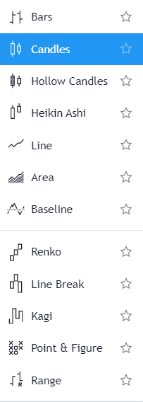
There are different forex chart types used for technical analysis in trading. Bars, Candles, Hollow Candles, Heikin Ashi, Line, Area, Baseline, Renko, Line Break, Kagi, Point & Figure, Range chart, etc.
Candlestick Chart
A Candlestick chart also called as a Japanese candlestick chart which was founded in the 18th century by Japanese rice trader, Munehisa Homma. He discovered that, while there was a connection between price and the supply and demand of rice, the markets were strongly influenced by the emotions of traders.
The emotions of traders remain the same at all the time. So, the candlestick chart can be used in any markets to measure the demand, supply and the emotions of traders.
This old candlestick technique was introduced later to the western world by Steve Nison in his popular book, “Japanese Candlestick Charting Techniques”.
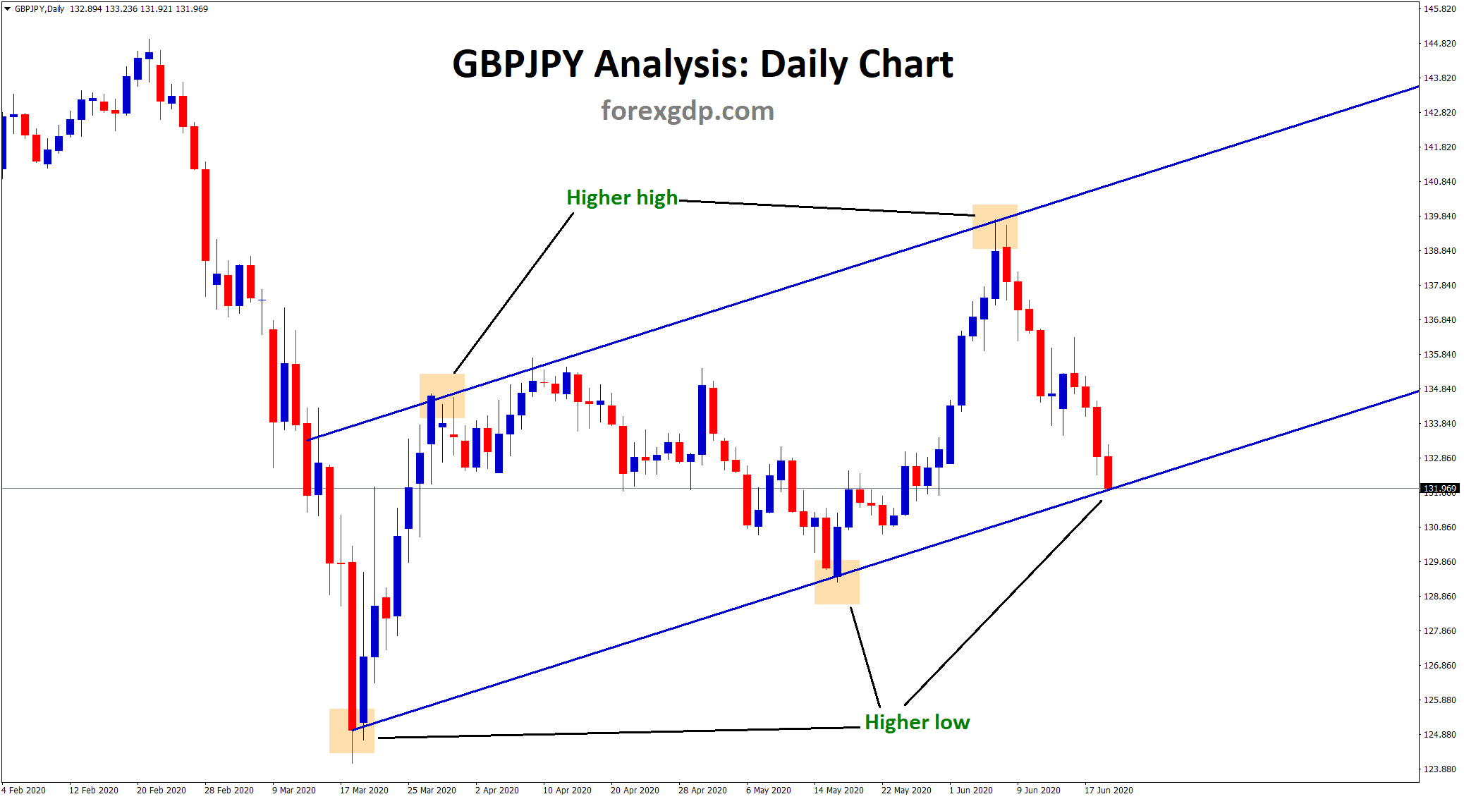
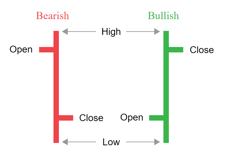
Candlestick charts are a powerful technical tool that packs data for multiple time frames into single price bars. Example: if you look out the daily candlestick chart, each candle shows the full price performance of the particular date in the colourful body of the candle.
Candlestick patterns, which are technical trading tools, have been used for centuries to predict price direction.
There are various candlestick patterns used to determine price direction and momentum
Hollow Candlestick Chart
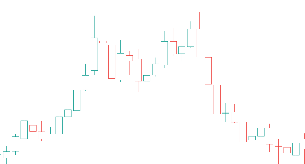
Hollow Candlestick chart is similar to the candlestick chart showing high, low, open, close of the candle. but the body of the candle remains hollow. Meaning No colour inside the candlestick body.
Hollow Candle eliminates the solid colour in the body of the candle.
Heikin-Ashi Candlestick Chart
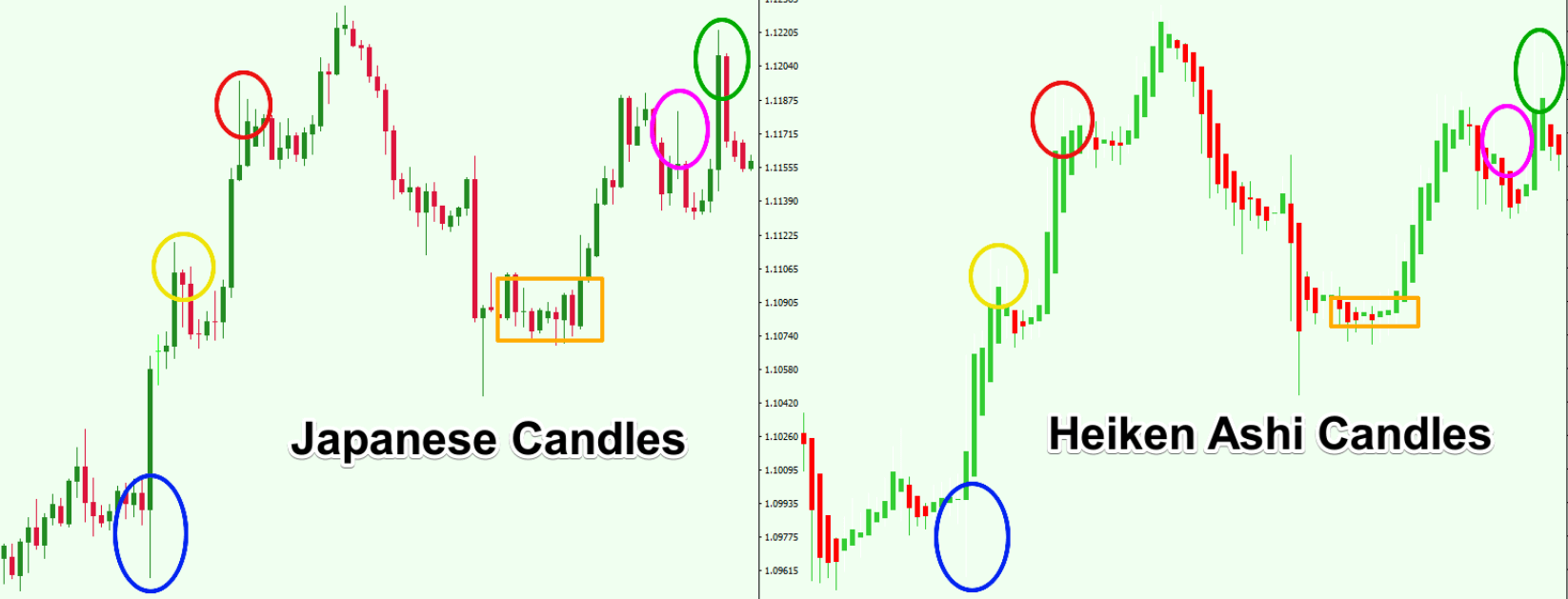
Heiken-Ashi means “average bar” in Japanese. Heikin-Ashi is similar to the candlestick chart, but it connects the average price of the current candle and previous candle.
The main difference between traditional candlestick charts and Heikin Ashi (HA) charts is that HA charts the average price moves, creating a smoother appearance. Because the Heikin Ashi price bars are averaged, they don’t show the exact open and close prices for a particular time period. However, it help traders to determine the trend reversal or trend continuation patterns in the chart.
Bar Chart
A bar chart shows the opening and closing prices, as well as the highs and lows which is similar to the candlestick. The only difference is there’s no solid body between open and close.
Bar charts help a trader see the price range of each period.
Line Chart
A line chart is a graphical representation of connecting the closing data points with a continuous line. This is the most simple type of chart used in financial markets to predict the price movements.
Line charts used to identify the trend direction of the market easier when comparing to other charts because it connects only the close price of each timeframe chart. Example: if you look out 10 candles formed in the chart, if you convert that candle chart into line chart, only the close price of the candles getting connected into a single line.
In the Line chart, the fake movements in the market are ignored. The candlestick chart looks very clear when comparing to other charts.
Area Chart
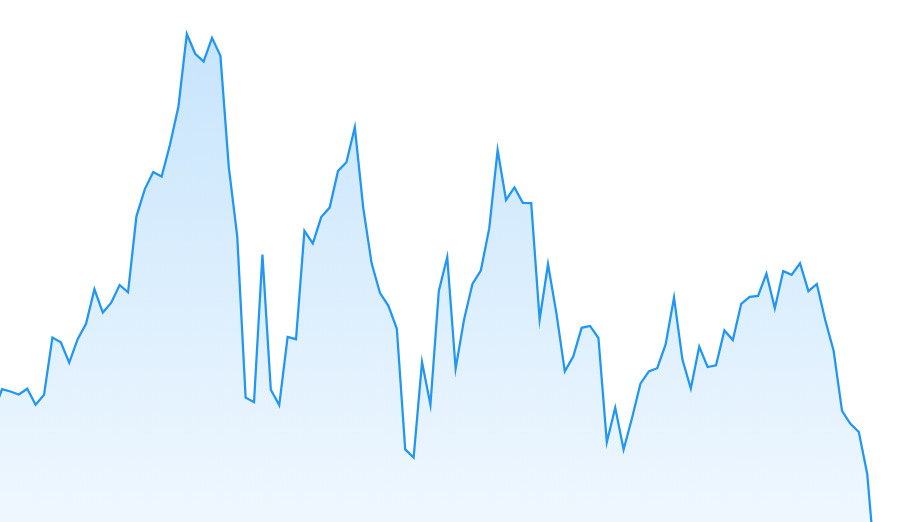
An Area Chart is a simple chart similar to the line chart. Long-term investors like to show the area charts to demonstrate the trend. Television channels consider the area chart style is one of the best charts that works for their audience.
Area charts have very little detail, they are for big-picture trading rather than day trading, for example. Trend lines, as well as horizontal support and resistance levels, are easy to see.
Renko Chart
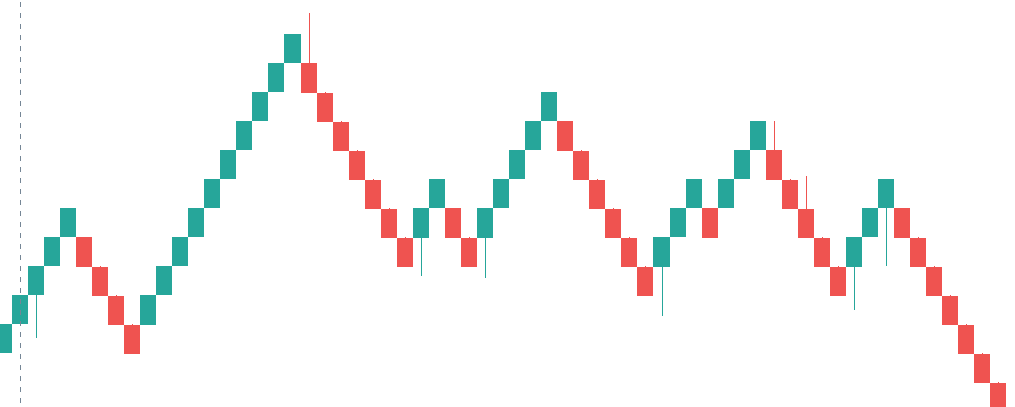
A Renko Chart is founded by the Japanese which is built only using the price movement rather than price or time intervals. The word “Renko” is originated from the Japanese word “Renga” which means bricks. This is the reason, you can see this Renko chart looks like a series of bricks.
A new brick is created when the price moves a specified price amount, and each block is positioned at a 45-degree angle (up or down) to the prior brick.
Renko charts are composed of bricks that are created at 45-degree angles to one another. Consecutive bricks do not occur beside each other.
Renko charts have a time axis, but the time scale is not fixed. Some bricks may take longer to form than others, depending on how long it takes the price to move the required box size.
Renko charts filter out the noise and help traders to more clearly see the trend.
3. How to Analyse Technical Charts?
Technical Analysis is the forecasting of future financial price movements based on an examination of past price movements.
Like weather forecasting, technical analysis does not result in absolute predictions about the future. Instead, technical analysis can help investors predict what is “likely” to happen to prices over time. Technical analysis uses a wide variety of charts that show price over time.
Analyze market using different types of charts
Different types of charts use different Technical analysis to predict the future price movement from the live chart.
Identifying Support and Resistance
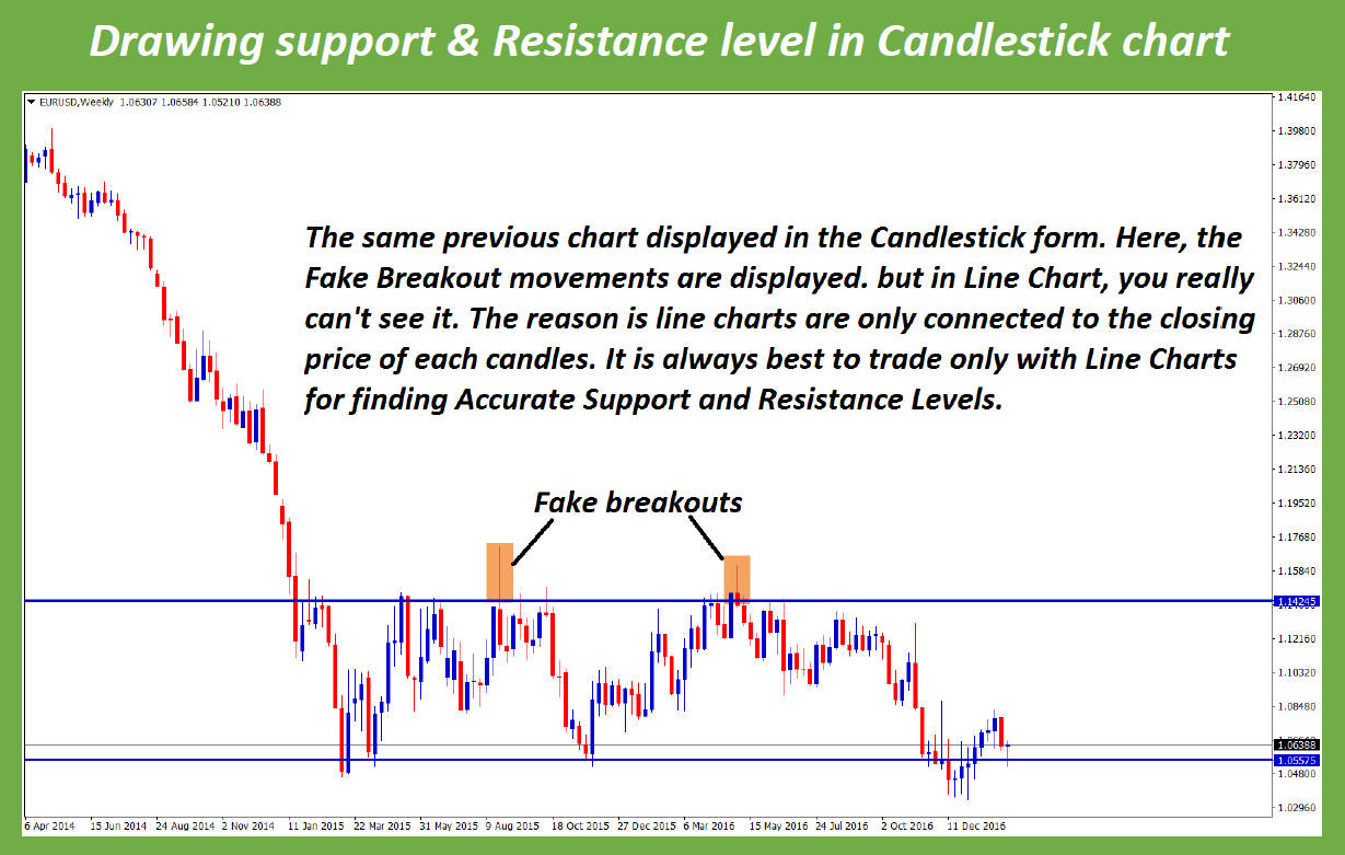
Support and Resistance level are more powerful in all financial markets. But most of them don’t know how to ignore fake breakouts in trading.
Which type of chart is suitable for identifying accurate support and resistance?
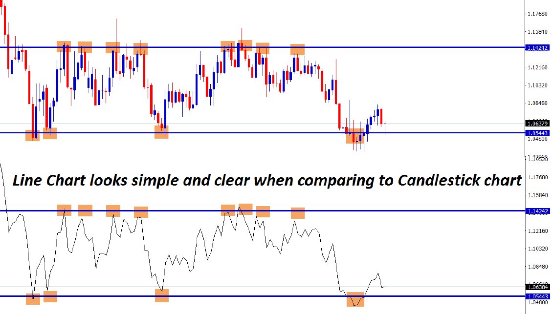
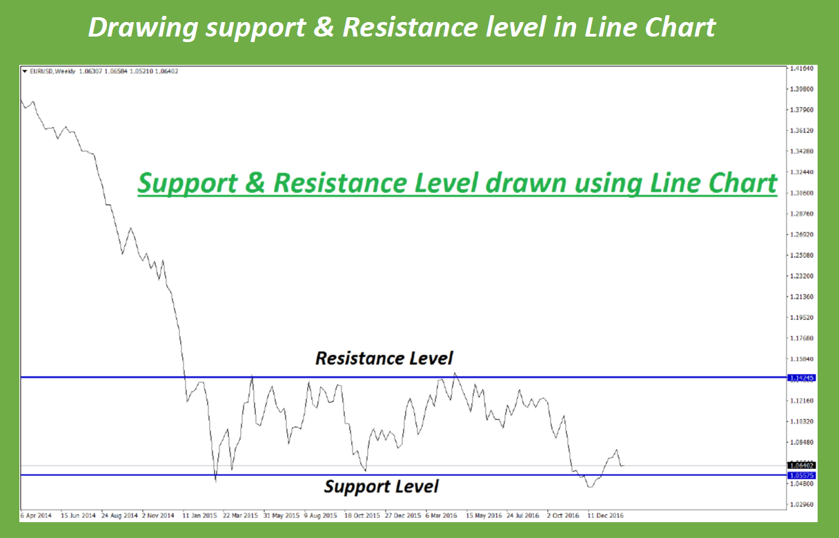
Candlestick Chart? NO. it’s a Line chart.
First, Let’s draw the support and Resistance Level in major currency pair EUR USD using the Line Chart.
Now, if you convert the same chart into candlesticks, you may see more noises and risks of fake breakouts in the market.
If you like to avoid unnecessary fake movements in the market, you should use the “Line Chart”. While making trading decisions, carefully consider the candle forex charts which may not be suitable for all investors.
Similar to these types of examples, there are lot of technical analysis carried out in live charting depend on trading strategy and market conditions.
Identify your trading purposes and investment objectives with great browsing experience of the charts in Tradingview website where you will see various traders, authors and service providers share their Experience, opinion as investment advice with more technical information such as shooting star, hammer, pin-bar, reversal, risk aversion, engulfing candle trades, instruments research, economic calendar events updates in live page view without refreshing.
Profits, losses statement provided by most of the advisors are manipulated by fake data information.
The world investment news indicators tools carry various risks level in your investment account.
Always check the tool, features, trade events, services performance of the site content, news indicator tools, brokers instrument, profit loss margin requirements, liability conditions, leverage, risk information advice in the site, data use, opinions, margin call, stop out level, Intraday position contracts, terms, regulation of the broker and residents qualification, etc.
FAQ
A forex chart is a visual representation of an asset price movement over a specific period of time. Charts are displayed in the form of Bars, Candles, Line, Hollow Candles, Heikin Ashi, Area, Baseline, Range, Line Break, Kagi, Point & Figure, Renko chart.
Line Chart, Candlestick chart is mostly useful for accurate entry and exits in online trading.
Support and resistance trading is suitable for all, however, the trend or forex indicators may not be suitable for all.
In Foreign Exchange trading, you should carefully consider the technical price charts, price trends, risk appetite and risk warning during the forex news.
Tradingview, MetaTrader four and MetaTrader five are one of the best and popular services who provides all worldwide chart live including all foreign exchange currency pairs with live price data and market commentary of experts.

